News
NatureMaps launched, interactive mapping for Citizen Science projects
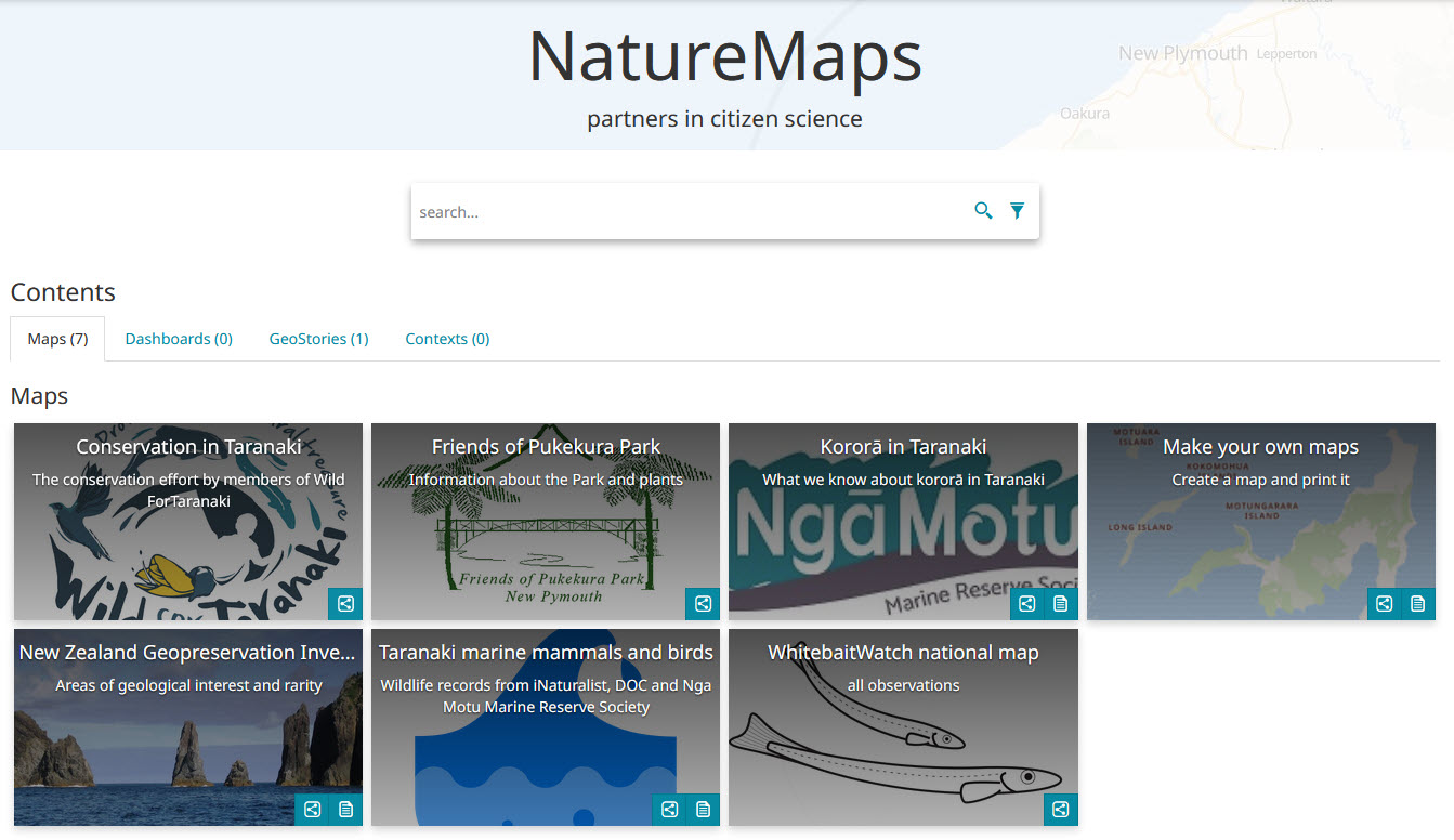
Citizen Science - projects, outputs and useful resources
Citizen scientists are making great contributions to our knowledge of the natural and physical world. This site is a showcase for New Zealand projects that you may like to explore, use, or contribute.
Thanks to the TSB Community Trust for supporting this initiative

This Curious Minds Public Participatory Platform project compared two restoration sites, one at Nowells Lakes, the other at Rotokare Scenic Reserve.
![]()

Analysis
What does that data mean?
By graphing and showing the results on a map, we get a good idea of relationships and changes over time.The examples below show screen shots from a seashore transect and a pest trapping project.
Records of a seashore survey
![]()
The 'Pest-Mapper' system
Here the rat-catch is analysed: Choose the period, and data is graphed and displayed on a map. 
Both of these projects were funded by TSB Community Trust. Thank you!

Previous page: Mapping Community Data
Next page: Mapping changes over time